Mapping a million road accidents: six mistakes found only after making them
The third tool on this domain is a road accident heatmap. The data is government open data and looks like you can just download it and go. Here is what went wrong six times on the way.
2026-08-20 作者 William Hsu
- What the data looks like
- 1. One row is one party, not one accident
- 2. The biggest accident hotspot in Taiwan is the front door of New Taipei City Hall
- 3. This data cannot rank "the most dangerous junction"
- 4. Refetching the whole screen on every pan
- 5. The database on a bind mount ran 74 times slower
- 6. Getting the colours wrong twice: once all red, once all blue
- Zoomed in, the dots formed a regular grid
- Looking back
What the data looks like
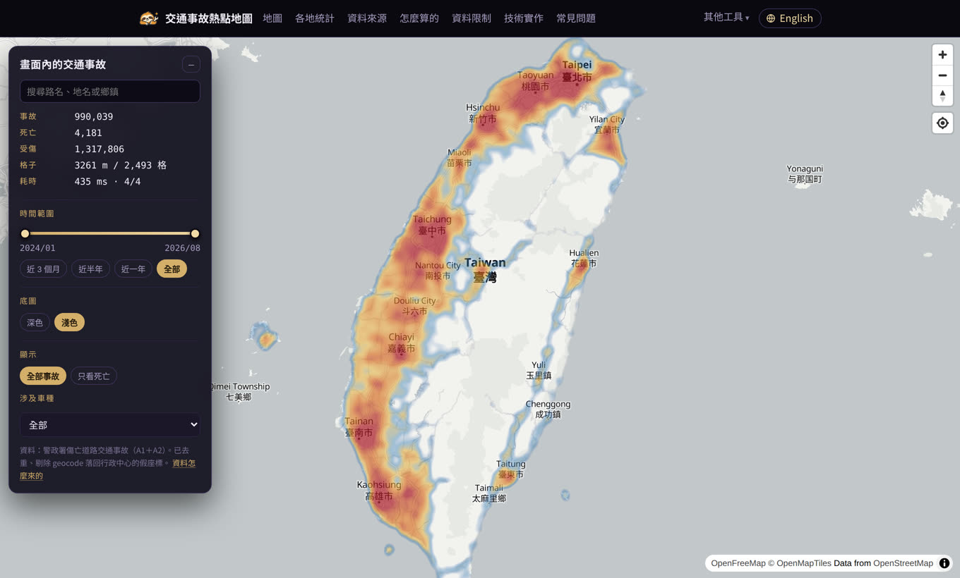
Taiwan's National Police Agency publishes case-level casualty accident data on the government open data platform: type A1 is deaths within 24 hours, type A2 is injuries or deaths after 24 hours. I used the full years of 2024 and 2025 plus the rolling 2026 data up to August.
- Raw rows 2,287,215
- Columns 51, including coordinates, weather, light, speed limit, signals, contributing factor, and each party's age and protective equipment
- Period January 2024 to August 2026, 32 months
The download is a zip; three years unzipped is 1.5 GB. My disk could not hold it, so the whole pipeline reads straight out of the zip without ever writing it down.
1. One row is one party, not one accident
An accident has as many rows as it had parties. A car hitting a scooter is two rows with identical time, place and coordinates, differing only in the party number.
Deduplicating 2.28 million rows leaves 1.01 million accidents, an average of 2.26 parties each. Counting rows directly inflates every figure by more than double.
2. The biggest accident hotspot in Taiwan is the front door of New Taipei City Hall
The first time I drew the data, the brightest point was in Banqiao, New Taipei, at 121.481, 25.009 — over two thousand accidents a year piled on one spot.
Those are the coordinates of the New Taipei City Government. When geocoding fails, the system falls back to a default, and the default is the city hall of that county. The accident addresses sitting on that point span 20 districts: Sanxia, Bali, Pinglin and more.
Catching them is simple: if the addresses on one coordinate span three or more districts, the point is fake. A real junction cannot be in Sanxia and Bali at the same time. Nationwide that found 128 such points and 17,784 accidents, 1.76% of the total.
Not a big share, but because it all lands on one spot it becomes the largest blob on the heatmap. Left alone, the most prominent thing on the map is wrong.
3. This data cannot rank "the most dangerous junction"
This one is not about code; it is the nature of the data.
Taichung has the most accidents in the country, 70,765 a year. But of the top 200 hotspots nationwide, New Taipei holds 121 and Taichung only 19.
The reason is that each city geocodes differently. The rate at which one coordinate is reused is 1.38 in New Taipei and 1.01 in Taipei City. In Taipei almost every accident has a unique coordinate, so a "hotspot" can never form.
Any "most dangerous junction" ranking built on this data is ranking each city's geocoding behaviour, not danger. The tool therefore deliberately has no leaderboard, only area statistics: over 300 to 500 metres, a coordinate error of a few tens of metres washes out.
Another 26.2% of addresses read "0.0 metres in front of X Road", which is the reference point of a road segment, not where the accident happened. Street-level reading is fair; junction-level conclusions are not.
4. Refetching the whole screen on every pan
The first API took a bbox: the front end sent the current map bounds and the back end returned that area. It worked, but panning by one pixel makes a new bbox, so a new URL, so a full refetch that neither browser nor CDN can cache. One response measured 954 KB.
Cutting the map into fixed tiles turned the URL into /api/cells/{z}/{x}/{y}. A fixed URL caches, and panning only fetches the newly exposed tiles:
- First load 12 tiles, 195 KB
- Pan 200 pixels only 3 new tiles, about 10 KB
- Pan back 0 requests, 14 milliseconds
5. The database on a bind mount ran 74 times slower
Everything was fine in development; on the production site the same query took 5.5 seconds.
In production the folder is bind-mounted from the Windows host into the Docker container. SQLite does a large number of small random reads, and that access pattern is dreadful over a bind mount. The same query, three ways:
- Dev machine, local disk 74 ms
- Container reading the bind mount 5,500 ms
- Container reading a local copy 84 ms
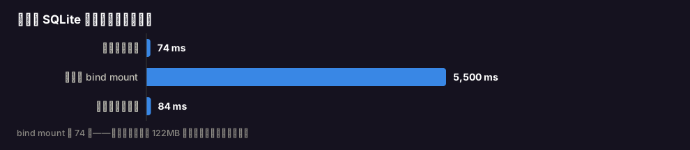
The fix is to copy the database sequentially into the container's own filesystem at startup and use that. Sequential reads are fast: 122 MB takes a few seconds. This problem is invisible on a development machine and only appears after deployment.
6. Getting the colours wrong twice: once all red, once all blue
Heatmap weights are relative, so how accident counts map onto a 0–1 weight decides how the whole map reads.
The first attempt was all red: when I moved the API from bbox to tiles I dropped the weight field. The front end saw nothing, treated it as unset, and gave every cell full weight whether it held 1 accident or 300.
The second attempt was all blue: I used the 97th percentile as full scale. But this distribution is extremely skewed — at national zoom the median cell holds 38 accidents and the largest holds 15,601, a factor of 400. With the 97th percentile as the denominator, 97% of cells sit at nearly zero.
The final version takes a logarithm against the maximum. The median cell gets 0.38, a five-hundred cell 0.64, the largest 1.0 — and the middle of the range finally spreads out.
Zoomed in, the dots formed a regular grid
A user reported that at street level the dots looked suspiciously regular and did not line up with the roads.
Because I was drawing the centre of each cell. Draw the centre of a 13-metre cell and at street level you see the grid, and roads of course do not pass through the middle of every cell.
The fix was rebuilding the database to also store the sum of the accident coordinates in each cell, so a query can return that cell's real centre of mass. The dots now land on the roads and follow the network.
Looking back
Only the fourth and fifth of these six were technical problems; the rest came from assuming the data was clean. Government open data is actually decent — detailed fields, diligent updates — but it is designed for administrative use, and that use is not drawing maps. The coordinates were added later, by a process with its own logic, and that logic is harmless statistically and fatal on a map.
Next time I am handed an open dataset, I will go and look at how the most extreme values got there before I draw anything.